University at Albany
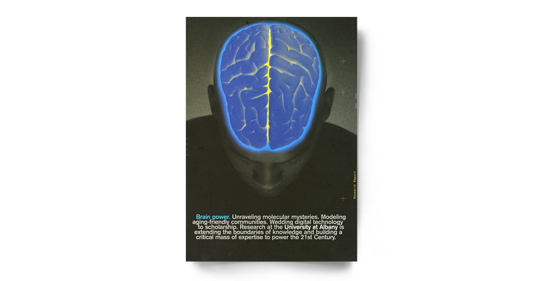
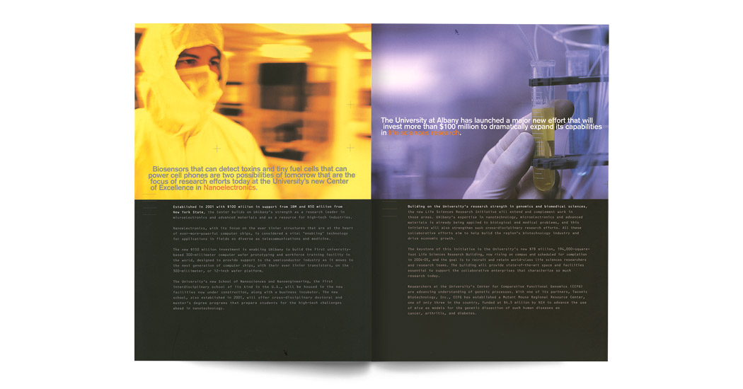
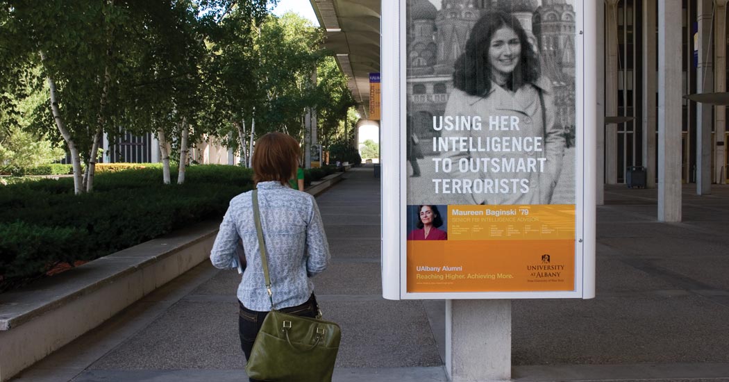
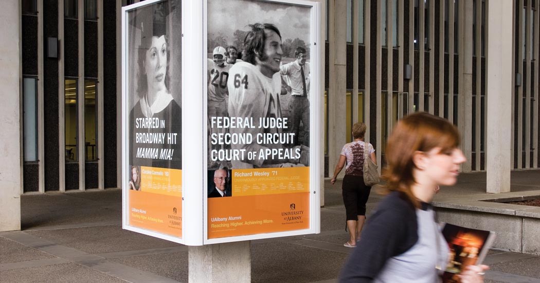
The university is a longtime client for whom we've done a significant amount of work. We designed an admissions campaign that helped recruit top students, environmental graphics to engage faculty and students, a new logo and identity program, and materials for the university's first capital campaign.
Admissions
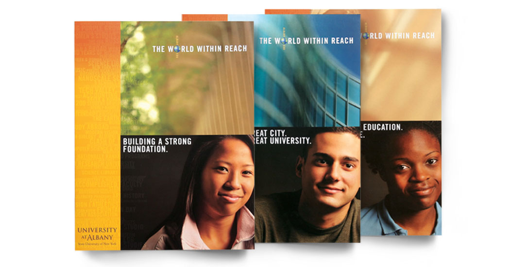
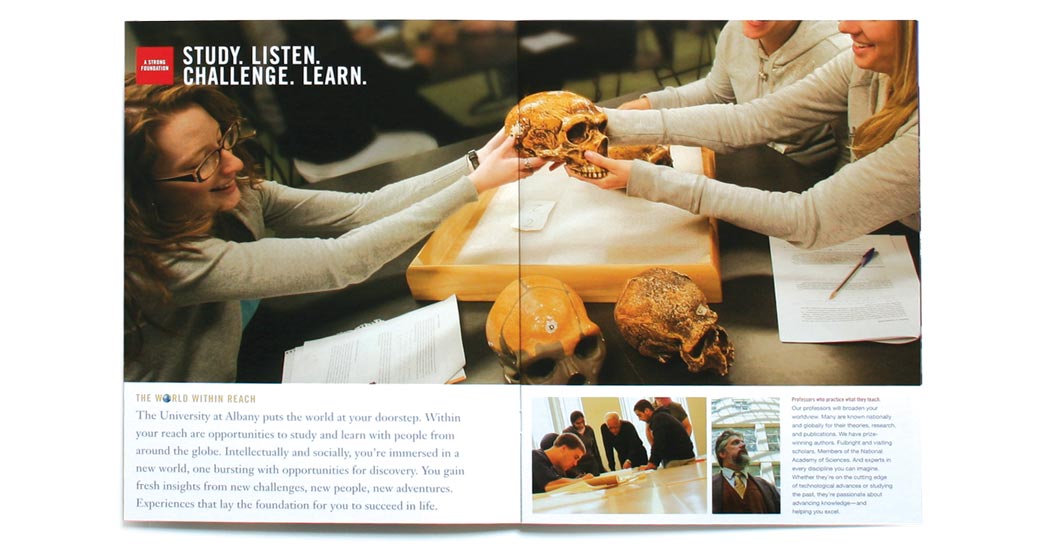
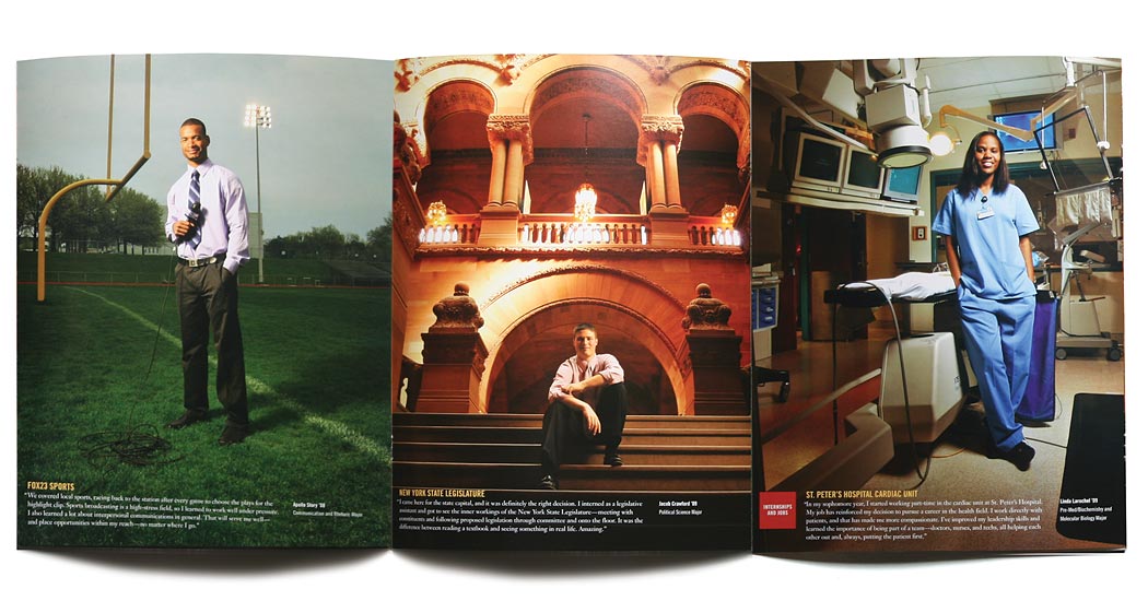
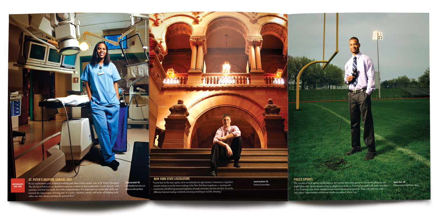
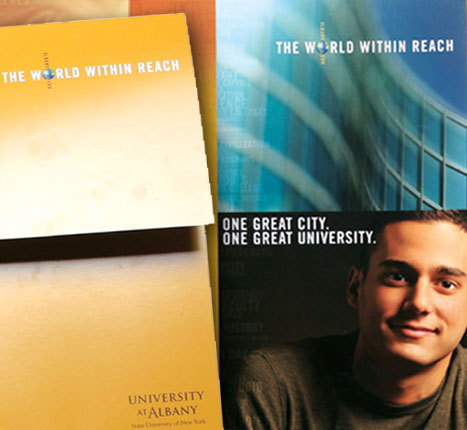
Instead of a typical viewbook we created a package of materials that could be mailed out individually or handed out as a complete kit. The look and feel of the package conveyed a sense of quality and academic strength.
Results
The university’s main goal was to increase the number of high quality students (based on GPA and SAT scores). In the first year of publication, applications and enrollment of high quality students increased by 18%.

Rebranding
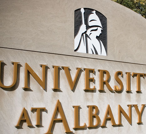
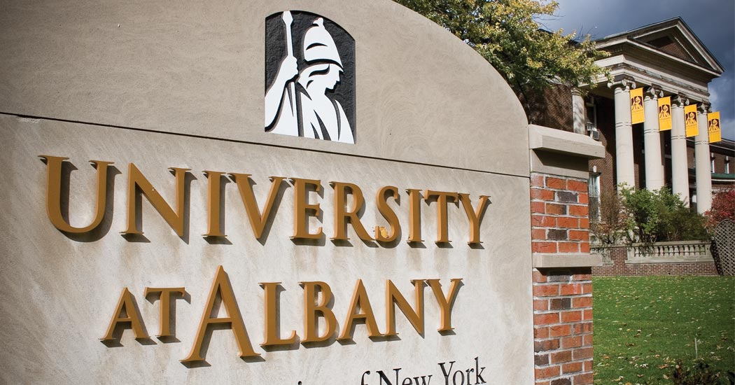
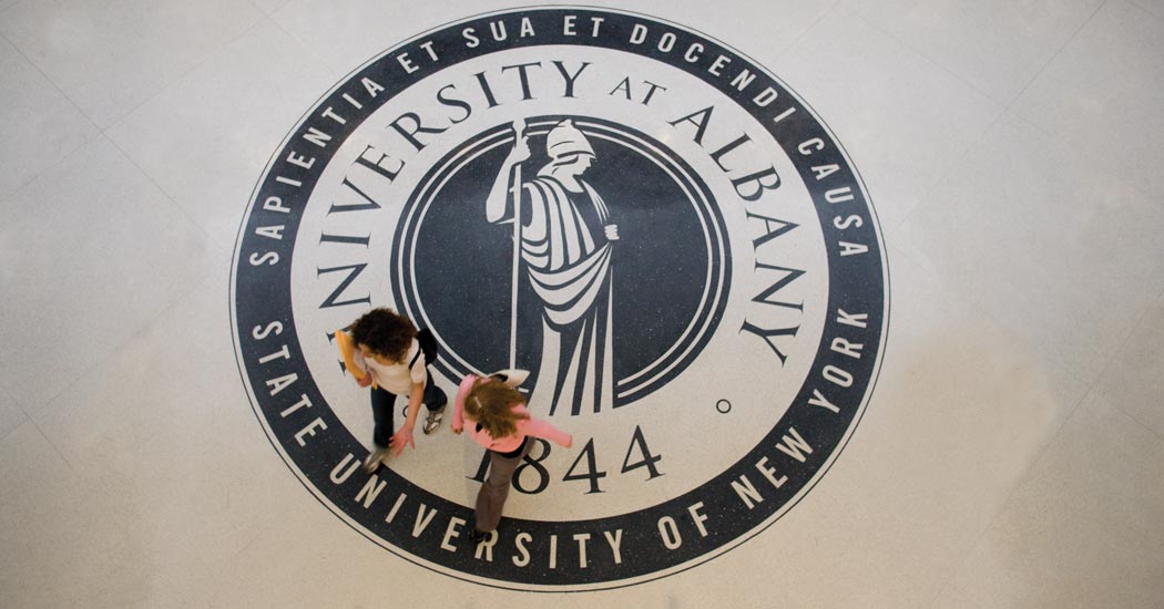
We led a committee of 30 people from across campus through the process of creating a new identity for the university. We created a comprehensive identity manual that outlined the application to signage, publications etc.
